|
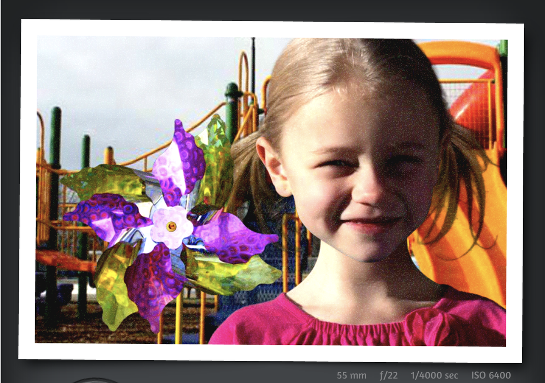
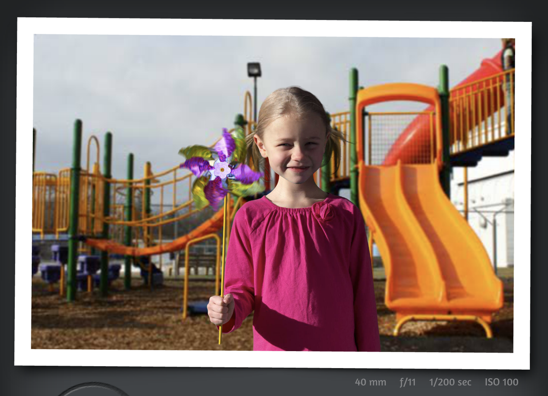
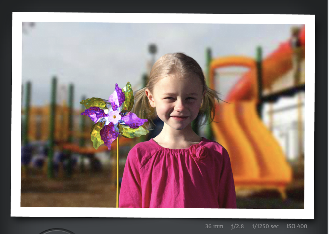
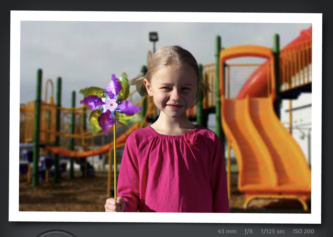
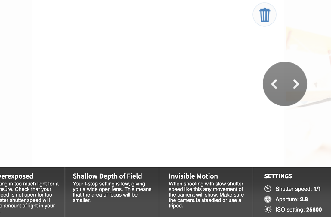
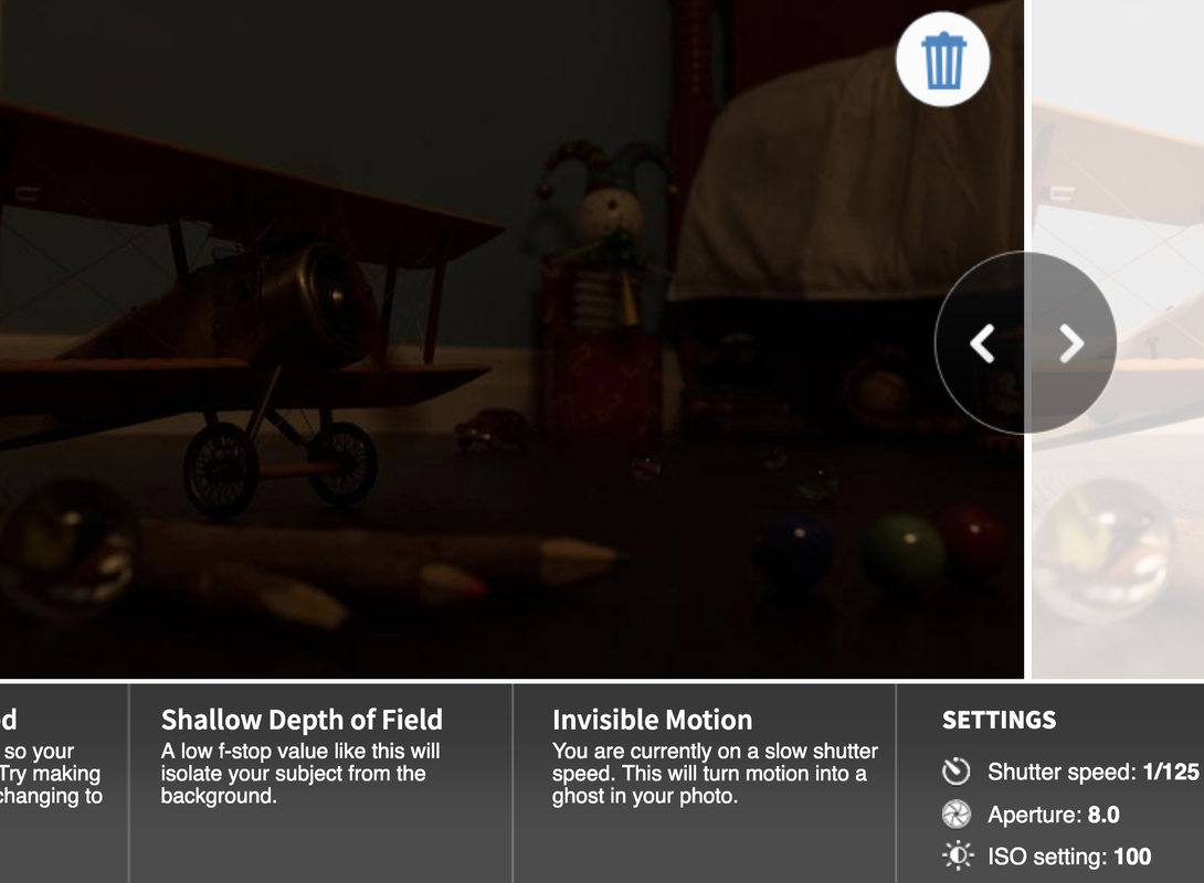
This image has a focal length of f/11. This means that the image has a pretty close focal length and a bit of blur in the background. This picture was also taken by the camera with a 40mm camera aperture. This means that the camera let in some light with a long distance camera focus. This is why the picture is kind of light and a bit dark in some areas in the background. The shutter speed was 1/200 seconds. This means that the camera took the picture and let light in very quickly but taking a very stabilized picture. This image has a focal length of f/2.8. This means that the image has a close focal length with a lot of blur in the background. The picture was also taken with a camera with the aperture setting to 36mm. This means that the picture was letting lots of light in at a closer range, it also shows why the girl has some contrast between the white and the blacks. The shutter speed was 1/1250 seconds. This means that the camera took a very fast exposure to light and did not allow motion blur. This image has a focal length of f/8. This means that the image has a far focal length with some blur in the background. The picture was also taken with the aperture setting to 43mm. this means that the camera had a smaller camera lens. The shutter speed was 1/125 seconds. This means that the shutter was pretty fast and not letting lost of light in quickly, it also shows why the image is kinda dark. This image was taken with an iso of 25600. this is a very fast film with means that the film was very sensitive to light. The image was over exposed to make the picture pure white. If it wasn't so over exposed, the image would be very grainy and have lots of noise This image was taken with an iso of 100. Which means that the image is very dark and not so sensitive to light. The image is also shown to have no grain. This is because of the low iso setting. Which makes it take a great picture but making the picture a bit dark or under exposed. |
Photography Assignments
Patterns
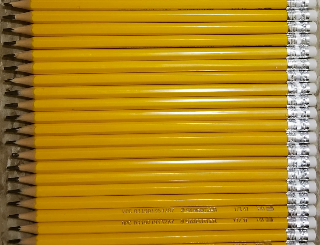
This is an image of a line of pencils. i took this picture because the pencils had a very linear pattern to them. When i went into Lightroom, i first cropped the photo to just be the pencils so that there were no distracting background stuff, i then started to do the white balance to correct some contrast in the photo. After that my main goal was to make the pencils to look as vibrant as possible without making them look fake.
|
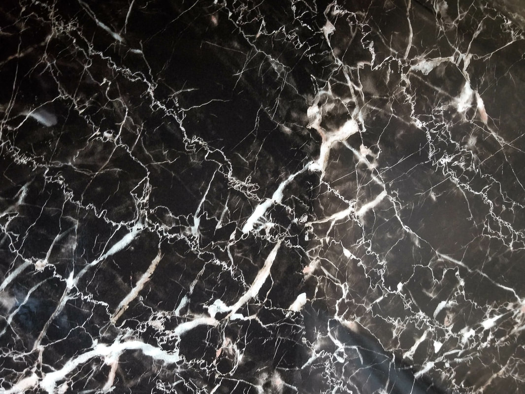
This is a picture of a table top that had a very good pattern to it. The reason why i took the picture is because it looked kinda like a thunderstorm and had some good contrast to the picture which made some good patterns. The first thing i did was to crop the photo so just the pattern was showing and no floor. After that, i then started to add some contrast to show more of the whites and still show some detail. Finally, i did some minor corrections to some areas with the masking tool.
|
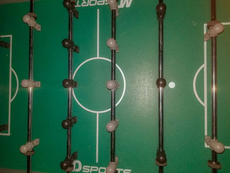
This is a picture of a foosball table that i have in my home. the reason i chose to take this picture for my patterns assignment was because it had lots of symmetry on each side. my first main task was to do the white balance because there was lots of whites in the picture. after that i started to remove some of the lights on the table and make it more vibrant and green without making it look fake or unreal.
|
Circles and Ovals
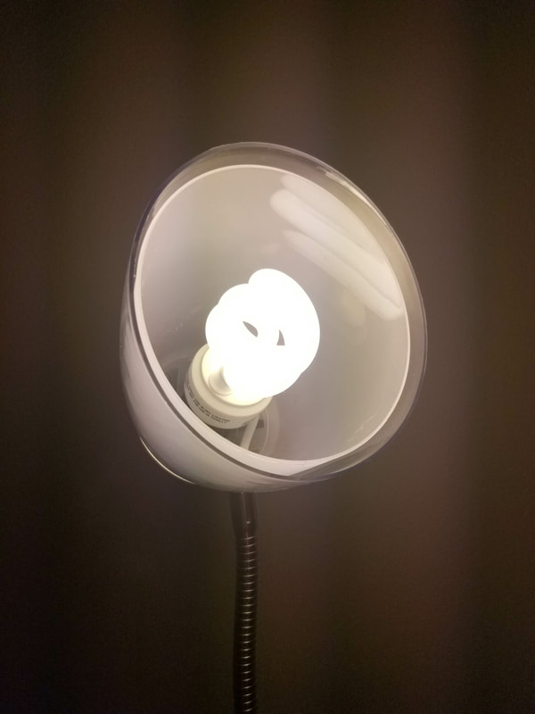
This is an image of desk lamp that i took. i chose to take this photo because it had a very good radial balance and i liked how the light looked with the dark background. the first thing i did was to do a white balance, after that i did some adjustments to the color and make some places whiter than it was before.
|
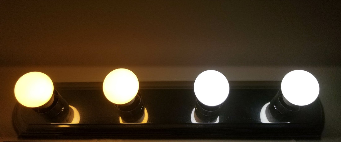
I chose to take this picture for this assignment because it had a very good symmetry and also didn't, this is because half of the lights are white but the other half is yellow. The mirror in the background also does a good job of reflecting the light, so you see the light no matter where you look. For the editing all i did was make a white balance so it looks better, and crop the picture so only the lights are shown
|
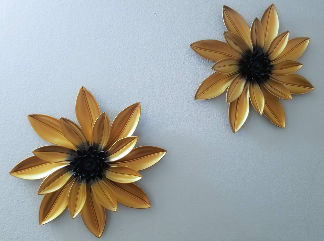
I chose to take this picture of some flower art decoration because the overall shape was a circle but each pedal was shaped as an oval which made some good radial balance. When editing this photo, i first did the white balance to make the colors in the photo balanced. after that i wanted to make the gold of the flower pop out so that there is a bit of emphasis on them flowers. o made an overlay of the flower only and adjusted the saturation and highlights.
|
Shoes
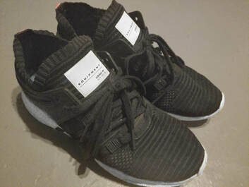
I chose to take this picture because this pair of shoes are one of my favourites and they look really good. when i went to edit them, i first did the white balance, after that, i did some whitening of the white parts and tried to remove some dirt marks. After all that was done, i cropped the photo to just show the shoes.
|
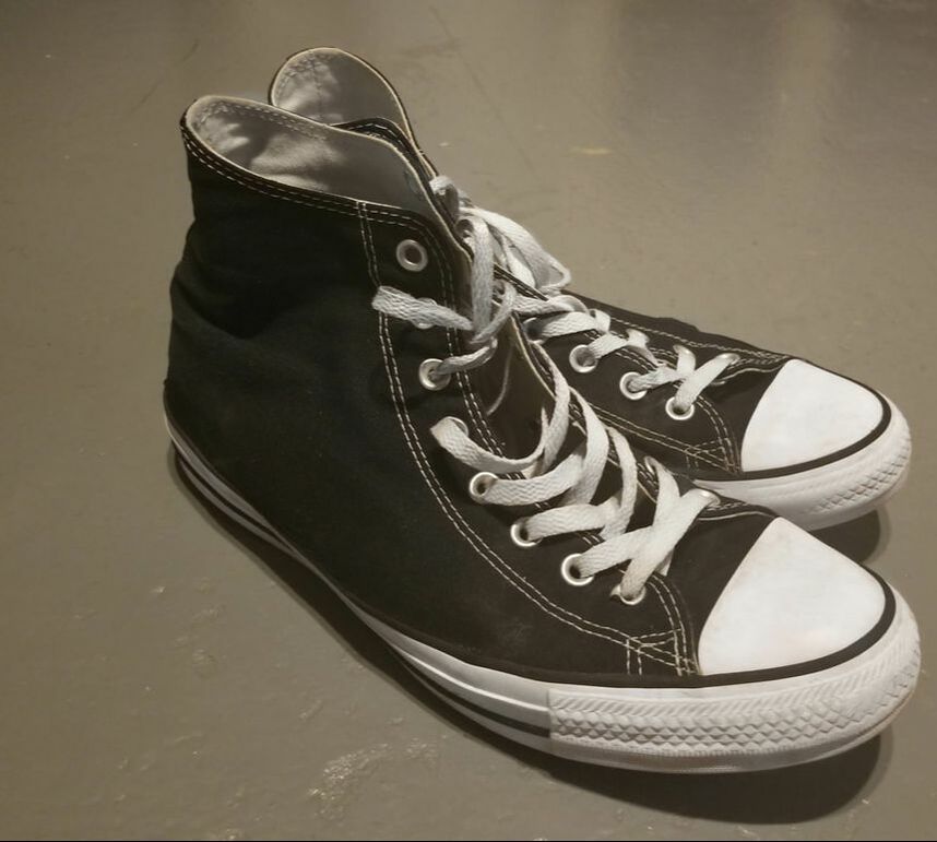
These are area pair of Converse's that i usually wear. These shoes are very good to take a picture of because they are very slim and have very good contrast between black and white. When i went to edit them, I noticed some spots that were very dirty so i used the whiten tool to whiten some of the white colours on the shoe. I also made some of the black on the shoe more black so that it wont show any dirt.
|
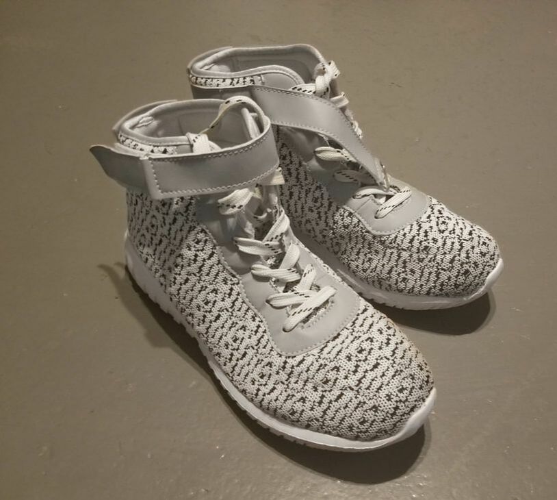
This is a picture of one of the shoes that had at the time of taking this photo. These shoes have lots of pattern which is one of the reasons why i chose to take a picture of them. When editing the photo i first cropped the photo so that only the shoes were in the photo, then did the white balance. After that i decided that the shoes were too yellow from usage, so i decided to make most of the shoes whiter with the teeth whitening tool.
|
